Scheduling App — Product UI Concept
A Product UI engagement, research to prototype.
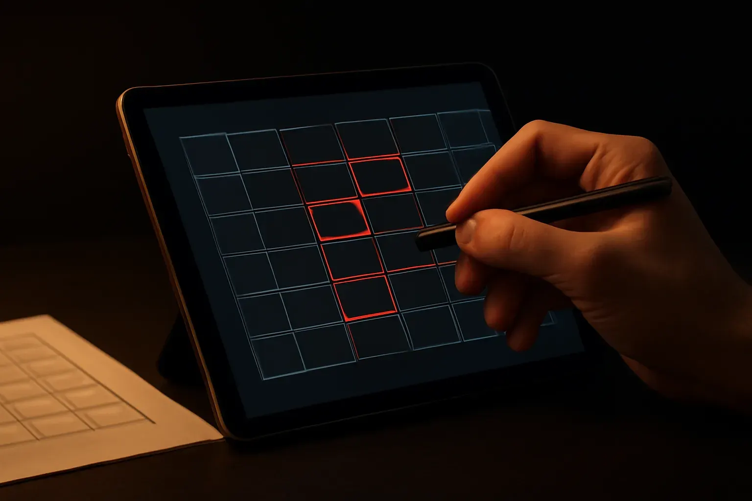
Context & goal
The brief: a small team's internal scheduling tool has grown feature by feature with no design behind it — users complete bookings but consistently miss secondary steps (confirmations, reminders) buried in the flow. The goal: a redesigned interface, backed by research, not a guess at what 'looks better.'
Approach
Same sequence sold on the UX/UI Design page's Design Sprint tier: a review of the existing flow and its friction points, an information-architecture pass on the booking journey specifically, wireframes for the corrected flow, and a component-based UI kit so the redesign is consistent screen to screen, not one-off polish.
What was built
Flow audit + findings document · revised information architecture · wireframes for the full booking journey · component-based UI kit in Figma · a clickable prototype covering the corrected flow.
Stack & performance
Design-phase deliverable — no production build to measure. Handed over as Figma files and a prototype, ready for an engineering team (ours or yours) to implement against the same performance standard the studio holds every build to.
Next project
Next